Insights
An actionable reporting interface
Role: Product Designer
Company: Hireology
Launched: May 2017 - May 2018
The Challenge
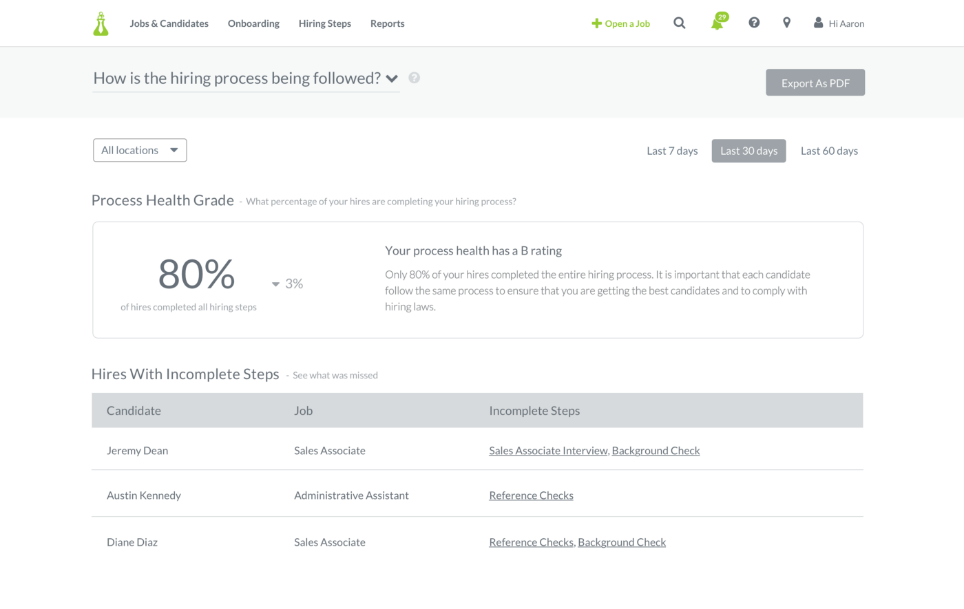
Hireology’s exisiting reporting tool wasn’t providing enough value to our customers. It suffered low usage, and yet customers were requesting custom reports every month from their support specialists.
Through our discovery research process, we learned that an overflowing dashboard of every single metric we track would have the same fate. Our users didn’t have time to sort through a large quantity of data, but they all had similar questions affecting their businesses and we needed to provide them with the right data to help answer them.
Our high-level objectives were to:
- Provide value to our customers by providing data-driven insights to help business and HR leaders make key business decisions.
- Decrease or eliminate related support time our teams were spending creating custom reports.
- Design the feature to account for growing organization structures to increase scalability.
Finding the right balance
I worked on a team with a UX researcher, a product manager, a data analyst, and several developers who all contributed to this project.
We interviewed 10 existing customers in various industries to understand what kind of metrics they were tracking–if any, and which were the most important to the success of their organization. We discovered that larger customers tended to be more diligent about tracking metrics and had multiple spreadsheets on hand to share with us. But many of the smaller businesses others weren’t doing any kind of reporting at all and were intimidated because they didn't know where to start.
“We are still just trying to get these processes in place. We aren’t quite there yet.” Taken from customer interview
It became clear that we had users at both ends of the spectrum so I needed to design something that was robust enough to appeal to power users, but also simple enough for those just trying to answer the question, “Are we doing this right?” We now knew what questions our users were asking from our research and I hypothesized that we could tell them a story with their data that would make it more meaningful and help them make better hiring decisions.
Early wireframe
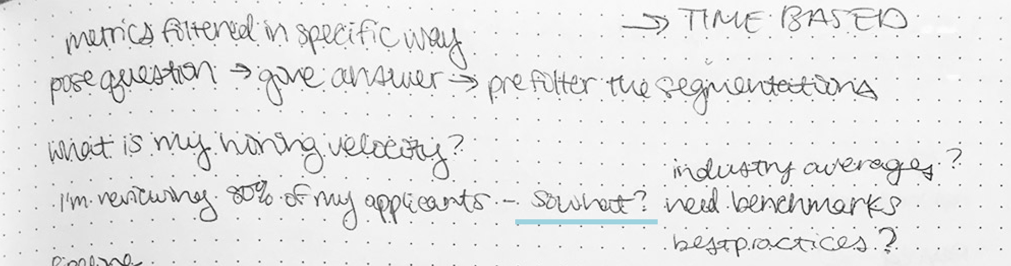
So what?
We started with three important questions to stay within a small scope. They were:
- How efficiently are people moving through my hiring process?
- How well am I actually following my hiring process?
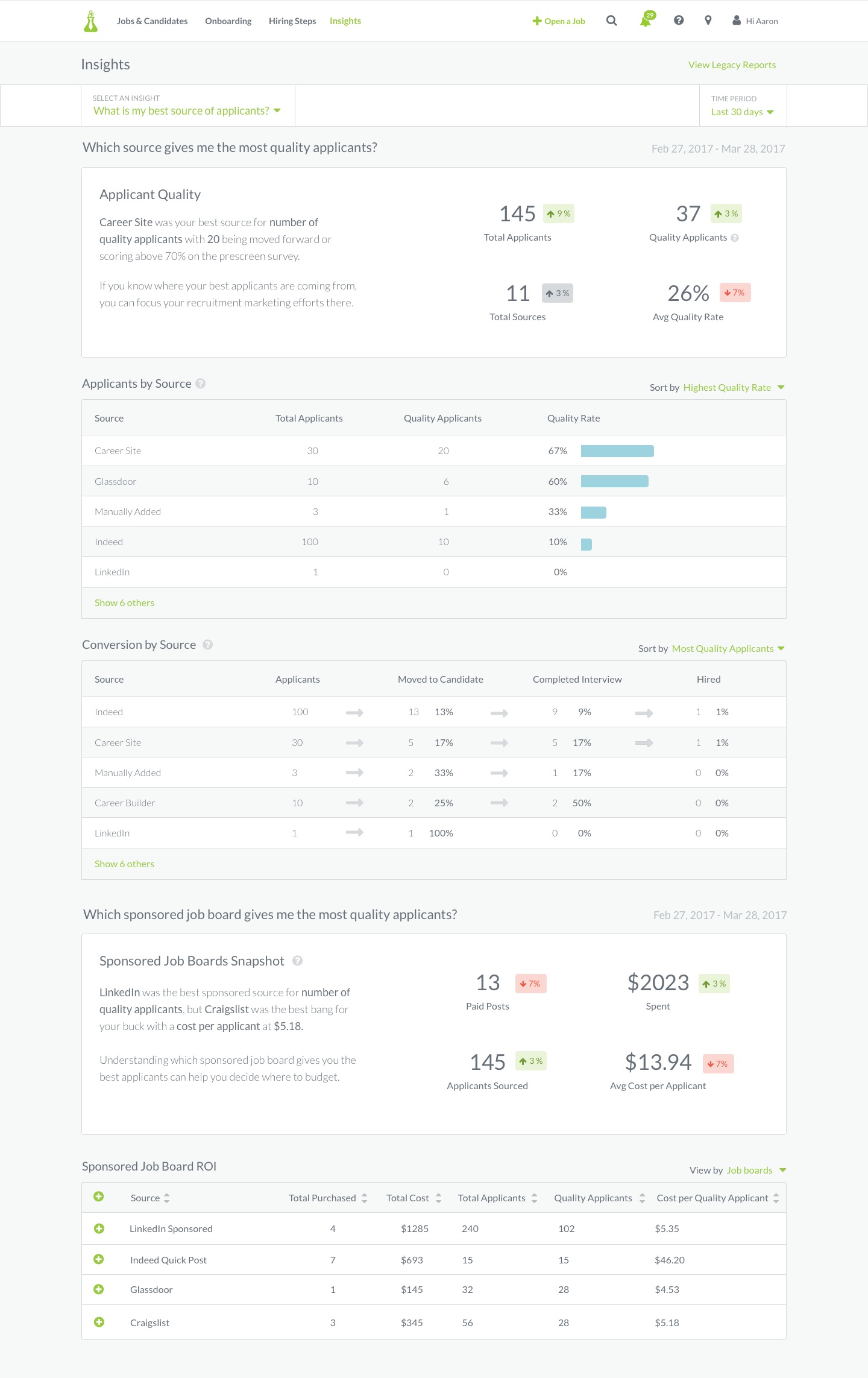
- What is my best source of applicants?
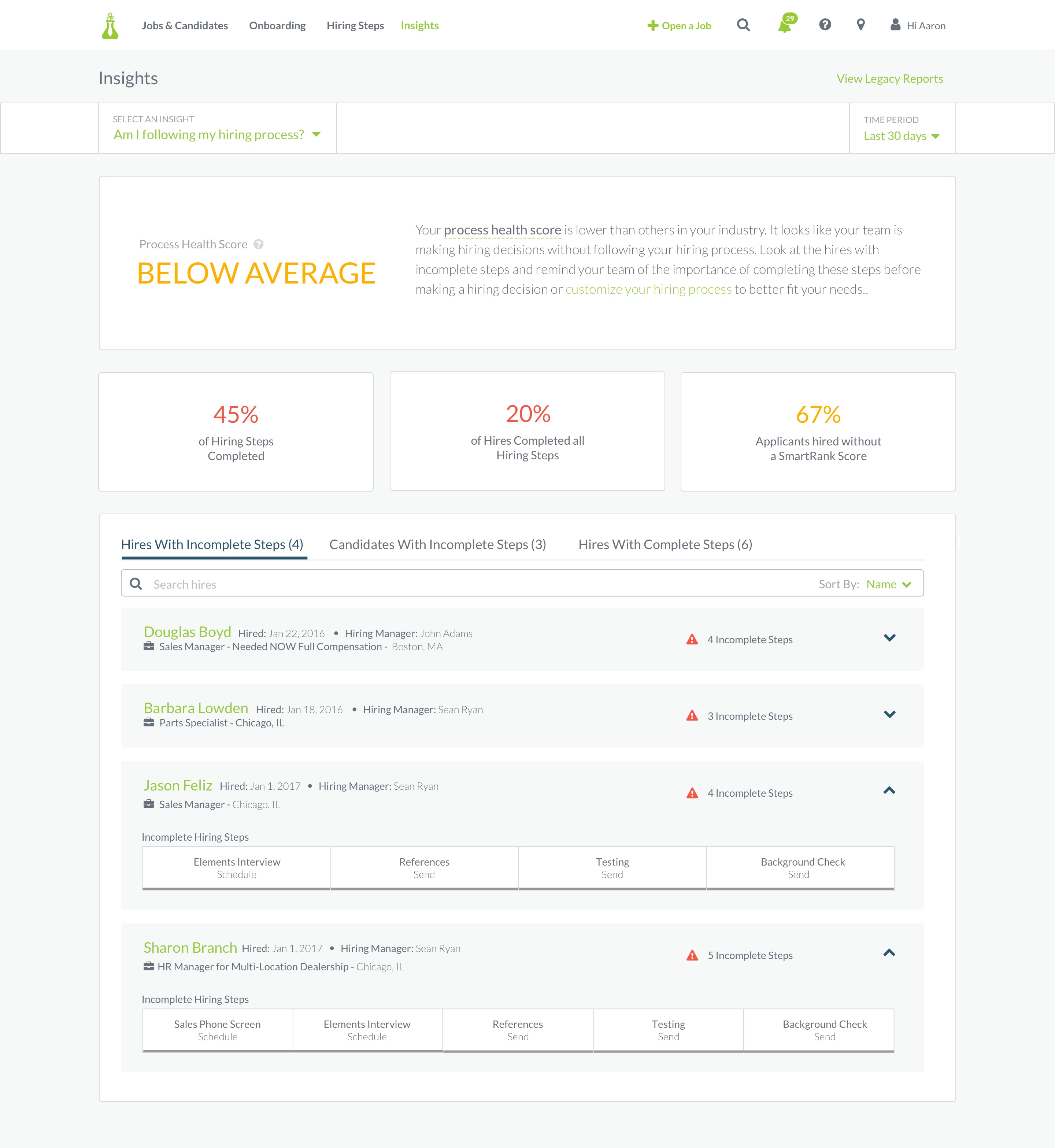
The next step was to try and find the best metrics to tell these stories to our users, but something kept nagging at me. So what if 80% of my hires completed all hiring steps? So what if I only viewed 74% of my applicants? So what if Indeed gave me the highest number of candidates? If our users didn’t have any context into what those metrics meant or what to do to get better then I was sure they wouldn’t see any value in the tool. We needed to answer “So what?” and provide actionable next steps to help them improve.
Notes
We took all of our hiring data and were able to create benchmarks based on the customer’s industry to help them understand their metrics and how they compared to others. I also added progress metrics to show how they had improved or worsened from the previous time period and wrote copy to give users an idea of what to do if they were below the industry average. We went back to our customers and ran the designs through usability testing. Were we telling the right data stories? And did our users care?
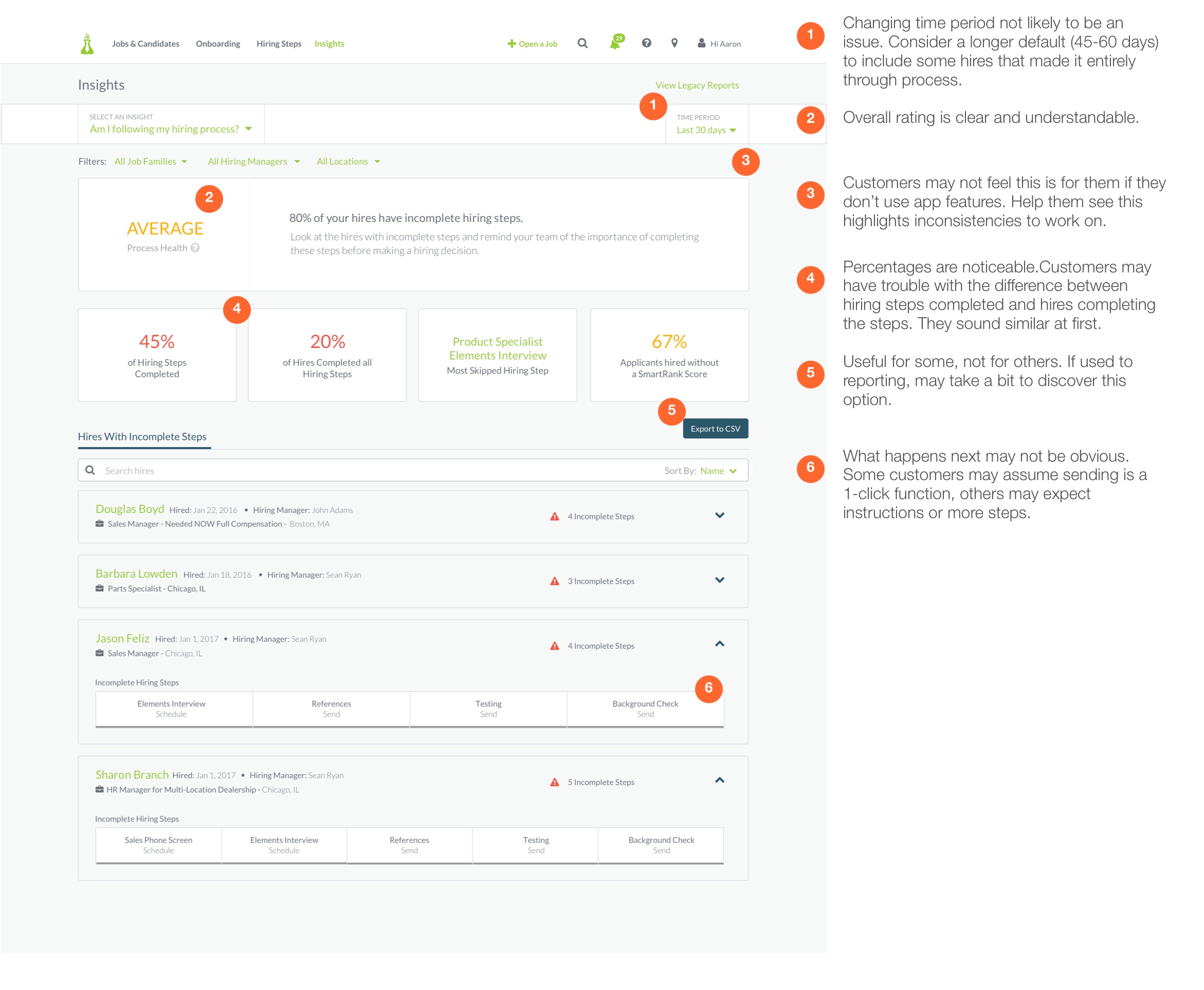
Usability report for process health view
In testing, there were some points of confusion and design tweaks that needed to be made, but users understood the overall interface. I discovered a big problem though–I had designed the prototypes with placeholder data because I didn’t have access to any real user metrics and it became clear that my numbers were way off from reality.
Dumb Data
Most of our users became distracted by the off numbers which made testing more challenging. I had requested real data to use from our developers earlier in the project, but it was never made a priority. This was my biggest mistake in the design process. I thought that using dummy numbers would be sufficient enough to show to customers, but it actually left them feeling unsure about the feature and whether or not they could trust it.
I spoke with my team and stressed how important it was to get actual customer data to work with and they made it happen. I updated the designs based on the new information and continued to test. Once we had real metrics in the prototypes, they told a real story that our customers were able to read back to us. We got feedback, made changes, and started to build.
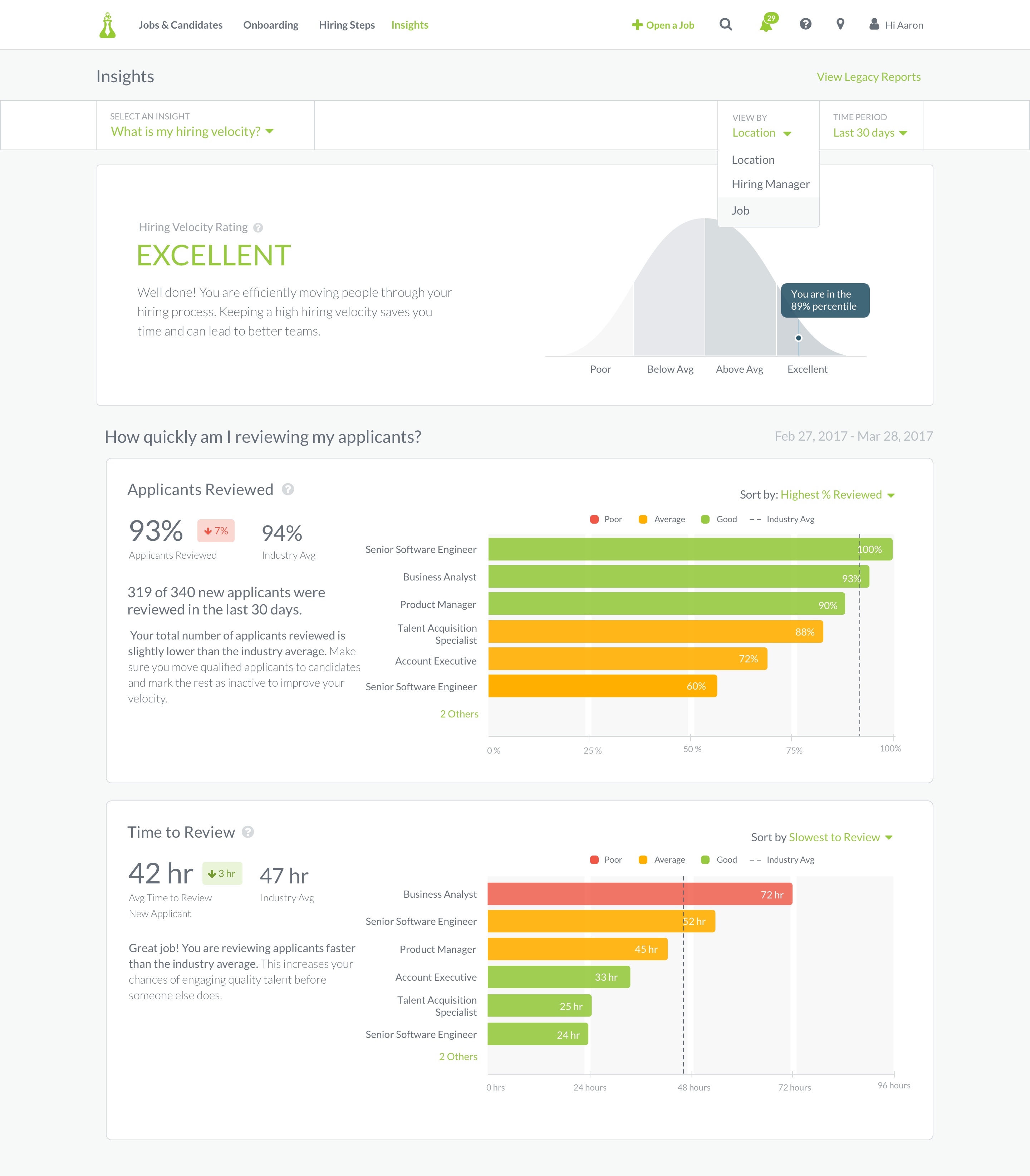
First Iteration of Insight Prototypes
Slow Roll
We built this feature very iteratively, releasing small improvements over time.
- We added a custom date picker option to allow users more control over the time period.
- We expanded the process health insight to show which hiring managers were doing a good job adhering to the hiring process–not just those skipping steps.
- We added a section in the sourcing insight about sponsored job board returns–which incidentally caused purchases to go down once customers knew the dollar amount they were spending per applicant.
- I designed a monthly email report to show users high level metrics and help drive users to the app seeking more information.
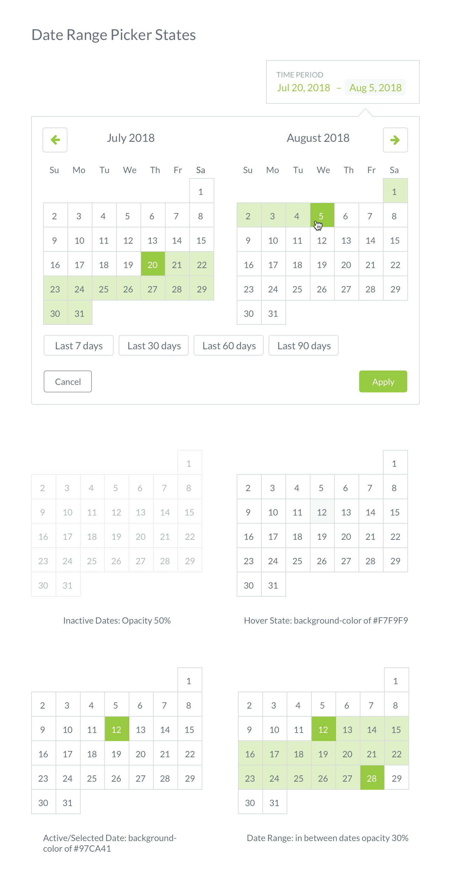
Date Range Picker UI
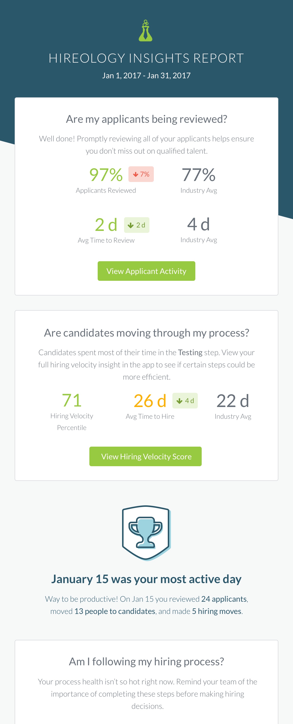
Email report
The Result
Insights was one of our most successful features in 2017-2018. Here were our key results:
- Our monthly active user goals were met and we saw a nice bump in usage every time the email report went out.
- Requests for custom reports drastically decreased saving support specialists time.
- Our customers have improved their hiring metrics over time. We had to adjust our benchmarks as our customers have made their hiring processes more efficient. We helped them save time and get better hires in the process.
- Because we built in multiple dimensions to view the data through, the product scaled automatically for bigger organizational hierarchies.
Learnings
This was my first major project dealing with data visualizations and luckily I’ve learned a lot since then. Somethings I would change or add to this project:
- I wish we had spent more time on the color theory behind our benchmark metrics. Performance measurements can be very emotional and I think we could have used color in a more meaningful way. At the time, the goal was to show users what areas needed the most help quickly, but there are other ways we could have achieved that.
- I would love to add a manager view. That was a persona we didn’t get to explore at the time because our main goal was to help HR leaders, but I believe giving managers access to their own data could be an interesting catalyst to improving their own behavior which would help the organization improve more quickly.
- The month over month progress indicators were a good start, but in a future iteration I would have liked to add more robust trending data to show customers how their performance over time.
I was extremely intimidated to start this project. I didn’t have a lot of experience with this level of data and I wasn’t sure I was the right person to be designing for it. Luckily, this worked in my favor because I was able to empathize with how most of our users felt about analytics–just tell me what a I need to know and how to make it better.
This project challenged me and help me grow as a designer. I am so thankful for Cole Nussbaumer Knaflic, Edward Tufte, and Stephen Few who all have written amazing books. They gave me the tools to choose the right type of data visualizations that wouldn’t mislead or confuse our users. I also learned the difficult lesson to never start a new design project without real data to work from. How can your design tell the right story if you don’t know any of the plot?