Zip Digital
Simplified resident notifications
Role: UX design, Front-end development
Company: Indatus, aquired by RealPage
Launched: April 2015
The Challenge
Indatus was spending a significant amount of time and money supporting Zip Digital; an aging multi-family mass-notification tool built. Instead of continuing to try and patch a sinking ship, we were tasked to recreate an entirely new product to replace it.
The users on our legacy product were frustrated. They had been dealing with broken software with hacks and work-arounds. Our customer base had expanded to other industries outside of multi-family and Zip Digital had become bloated with features that were no longer useful (or working properly). We decided that we needed to strip down the new application to the most basic user needs; focusing on clarity and reliability to gain their trust back and provide a consistent experience.
At the same time, the team was trying to manage the expectations of stakeholders. The engineering department was accustomed to running a user-centered, agile approach, but we were still working to get widespread executive support. This meant that we needed to hit the ground running to figure out our users needs, while proving to stakeholders the value of an agile workflow.
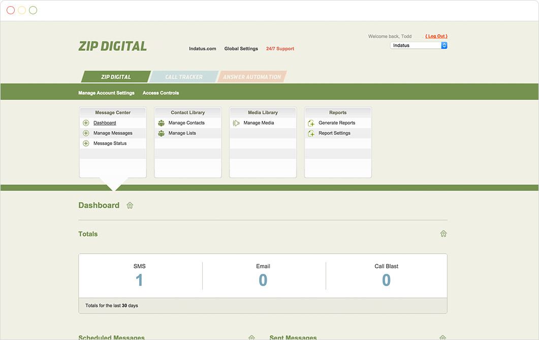
Legacy Zip Digital
The Process
When I came on to the project the engineers already had a working, bootstrapped prototype. Before we went any further I wanted to make sure that we were heading in a direction that made the most sense for our users. As a team, we went through several use cases for our personas. We ended up with lots of sketches that I turned into clickable prototypes focusing on the most important workflows, including contact importing and message creation.
We completed usability testing with 12 participants. Six were legacy Zip Digital users, and six were new to the product. The six legacy users had a variety of use patterns, which helped us discover the varying needs that the product needed to meet. One important take away we learned from testing them in their own environments:
"Every single in-person session was interrupted by a person walking into the participants office or calling them on the phone. These are busy people." Taken from usability report
Our users were working with constant distraction. They needed a tool that they could get in and out of quickly without worrying if their rent reminders went out or not. This helped us zero-in on three areas of focus.
1. Easy Contact Management
Users had various ways of keeping up with their contacts, from using a property management system to manually tracking them in a spreadsheet. We had to make sure that no matter where their list came from, it had to be easy to get into our system.
2. Three Ways to Communicate
Our multi-family customers catered to a wide range of lifestyles. From senior living centers to student housing, we needed to make sure that they could utilize the right type of message for their specific audience.
3. Powerful, Fast Feedback
One of the biggest complaints users made about the legacy software was that there wasn’t enough feedback to know if their messages had been sent or contacts updated successfully. Making sure that we could provide valuable feedback to remove that pain point was a top priority.
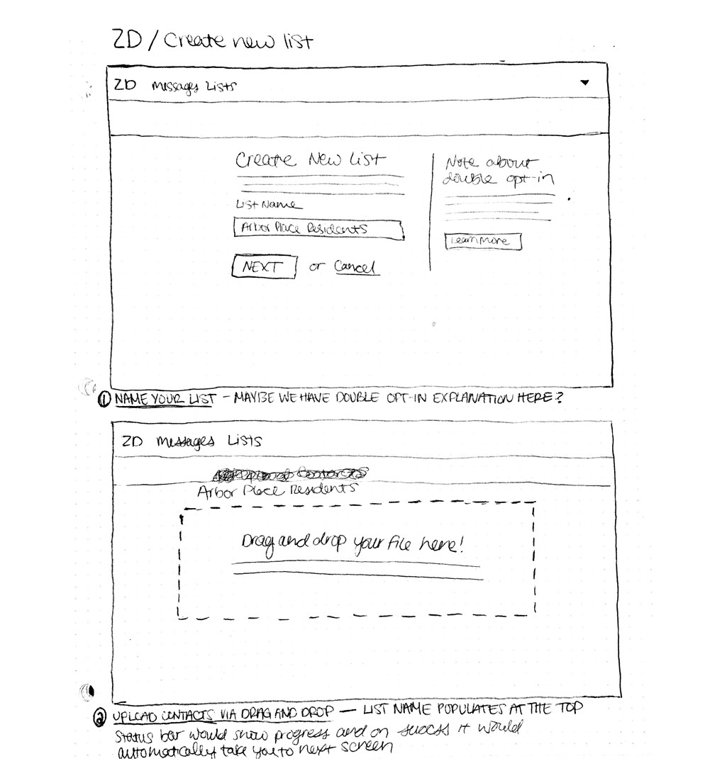
Early List Creation Sketches
Tackling Contact Management
We had a couple of hurdles to overcome when it came to contact importing and management. We needed users to have the ability to import their contacts into Zip Digital no matter what software or tracking system they were using for keeping up with their residents. Our first thought was to allow users to upload any CSV file and then map the data from their columns so that everything was imported correctly.
We tested a low-fidelity prototype with 12 users showing a column-mapping import. The user would upload a file in a drag and drop interface and then match columns from their uploaded list to their Zip Digital list. We showed the first few lines from each column with placeholder data to try and convey an example of what they would see.

Column Mapping Prototype
Most of our users had a lot of trouble completing this task. This could be due to a number of factors; some had a lack of knowledge of spreadsheets or how their property management software worked, and they were seeing unfamiliar, placeholder data. The takeaway was that we learned a lot about user expectations and decided to reevaluate the import process.

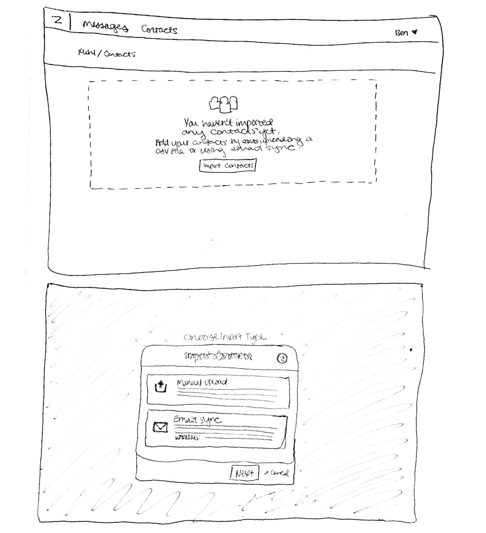
Import Modal
After going back to the drawing board with our new knowledge, we decided to use a CSV template that allowed users to copy and paste their contact data in to the appropriate columns. Customers responded better to this option because they felt it gave them more control for how their data was being imported. They could add as many custom columns as they wanted as long as they included: First Name, Last Name, and one point of contact.
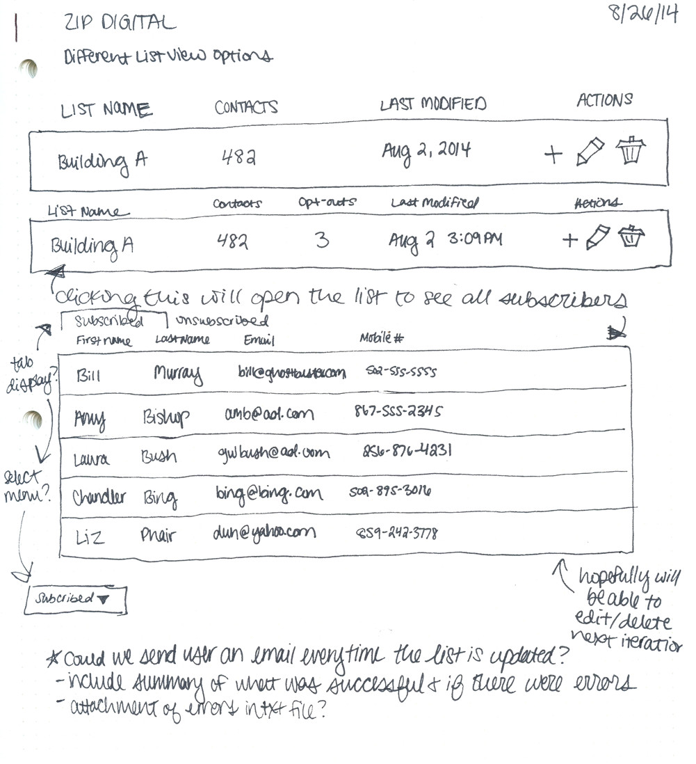
They could also create as many lists as they wanted, and each could have different contacts on them to allow them to target their messaging.Once a contact had been uploaded successfully, a user could see all imported data associated with that contact in one place, as well as any of the messages that had been sent to them.


List and contact view
Sending Messages With Ease
As mentioned earlier, our users are busy people. Message creation needed to be as simple as possible so they could get them out quickly and reliably. I decided to use simple form fields wrote friendly micro copy that would help guide users through creating and sending their messages.
Users could choose which list they wanted to send to, give their message an internal name, type it out, and send all on the same view. Once messages were sent, users could see a summary of the message and watch in real-time as it gets sent out to a list of contacts. They could also filter the recipients by their send status to see who they needed to follow up with.
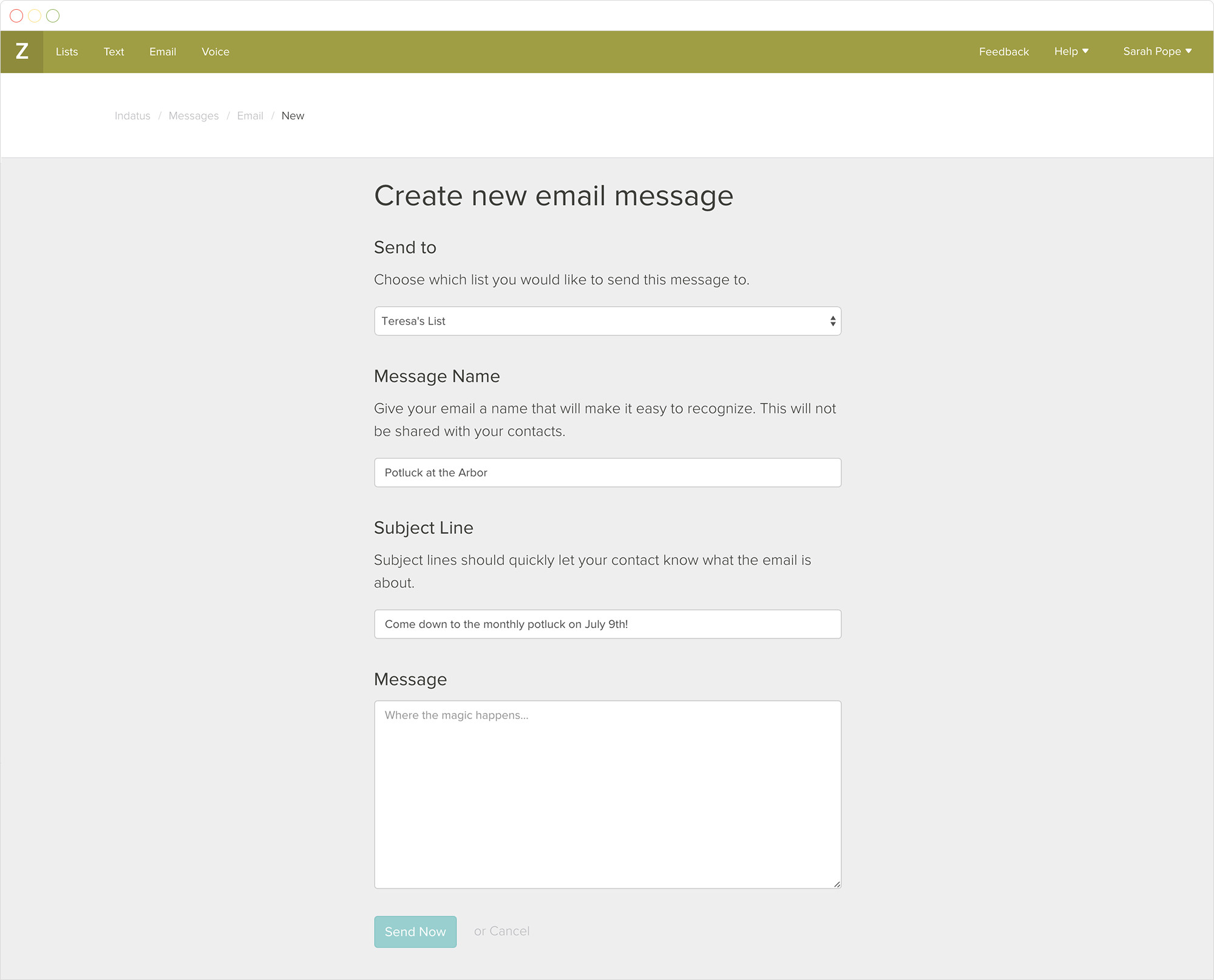
Creating a New Message
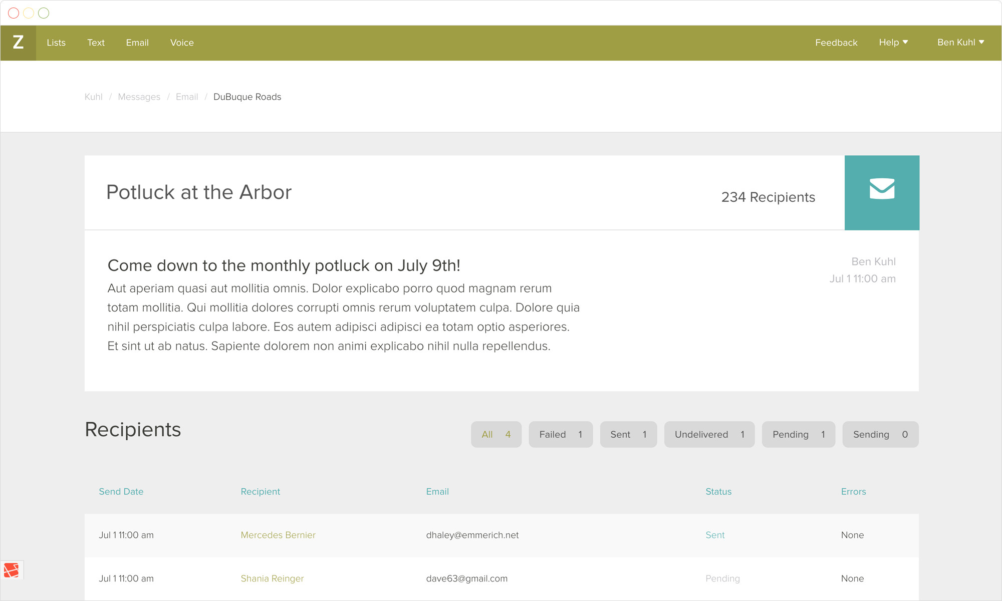
Sent Message View
Friendly Feedback
One of the most important things that users wanted in the new Zip Digital was good feedback. We wanted to reassure a user that things were going smoothly, or if errors came up, how could they be resolved?
I made sure that statuses were present in most areas of the app where data was incoming or outgoing and that errors displayed clearly when necessary. I also color-coded them to provide additional context at a glance.
I also ensured that all of our messaging had a similar voice and tone. This meant that stripping the old, robotic alert messages for more friendly language. If a user was having trouble or dealing with a delivery issue, I wanted to tell them what was going on and help them fix it.
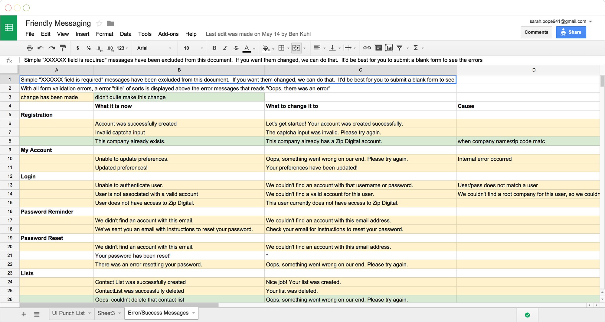
After this project, I created content guidelines for all Indatus products to help developers stay consistent.
The Result
We launched the MVP product on April 1, 2015 to a large portion of our customers to test and get feedback. Many of them said that, despite having a smaller feature set, it was a huge improvement over the legacy experience.
"After the rebuild of the product we saw a significant drop in customer calls and tickets. Customers were no longer having issues with how to utilize our product. The drop in tickets and customer complaints/problems has allowed us to focus our attention on new projects within our department." Stefanie Hogan, Customer Care
Another nice outcome post-launch was that sales of Zip Digital actually increased. The sales department said that people ‘got it’ right away and really saw the value in it. The sales bump also helped us with our secondary goal–showing the importance of UX research and design to our leadership team.
Last thoughts
During this project, I was able to gain insights through our research and use them to focus the product strategy. We had real data behind every deign decision, rather than assuming we knew what our users needed.
However, there are definitely plenty of areas that could be improved on, especially around the importing process. Downloading a CSV template and copying and pasting data was still difficult for a lot of users. They would have preferred a direct integration with their property management software so they didn’t even have to think about if their list was up-to-date. At the time, That was unfortunately unfeasible on our end at the time due to extremely high costs.
These were things that we planned to iterate on and improve in ongoing sprints, but shortly after the launch of the MVP the company was acquired and business goals changed. I would have loved to continue discovery to learn how to improve the app for our users, but I‘m still proud of the first iteration.